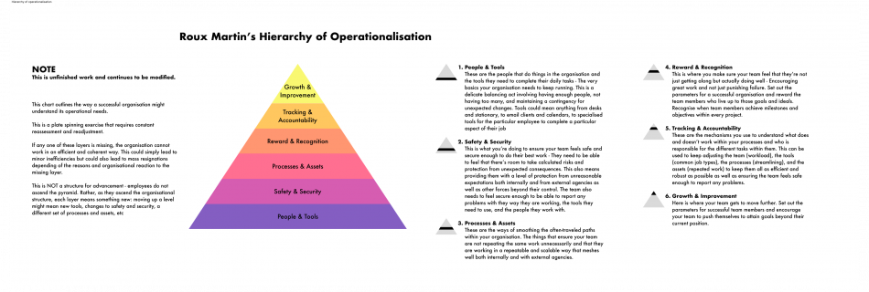
Joining Hyland with no Design Ops framework, I treated the challenge as a UX problem: understand the users, identify pain points, and find solutions within real constraints. Quantitative surveys paired with natural conversations shaped everything that followed: a connected system of tools, standards, and spaces designed to help designers do their best work. Bringing Order …
Read more “Design Ops at Hyland”
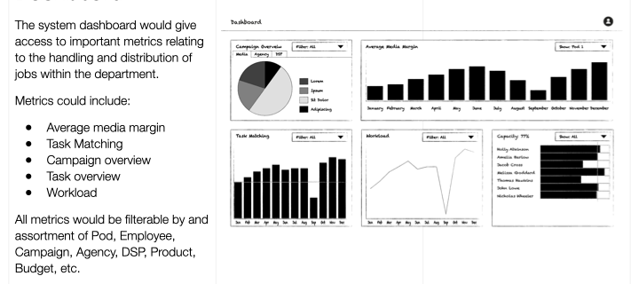
Satalia were called into Xaxis to help optimise work distribution using machine learning and AI. The original idea was that Satalia could build an engine that took into account every worker’s skills, likes, dislikes, and career goals and use this information to help to distribute tasks to those workers who were most suited or benefited. …
Read more “Workforce Optimisation – Xaxis (via Satalia /WPP)”
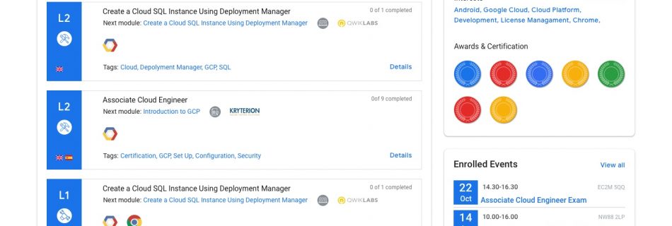
Google was experiencing lots of incomplete journeys with their existing Partner Learning products and wanted to understand why and where this was happening as well as solve the problem. Arriving at Google it became apparent that there were several different teams running different learning platforms each with its own problems. End users needed to use …
Read more “Centralised Learning Dashboard – Google (via Epam)”
Whilst working at Ness SES I had some great opportunities to work on mobile products. One of these was an app for a US-based disruptive used car dealership, Carvana. Initial Approach Carvana wanted something to keep their customer with them long after the initial car purchase. Using notes and whiteboard snapshots taken from stakeholder interviews …
Read more “Customer Loyalty Platform – Carvana (via Ness SES)”
Amberlight UX brought me in to run a research project end-to-end for the global communications company Ericsson, testing a web-based system management portal. They wanted to find and understand any usability problems that might have been overlooked in the design phase. Study Design Given some time to talk to the developers and explore the interface …
Read more “Network Admin User Testing – Ericsson (via Amberlight)”
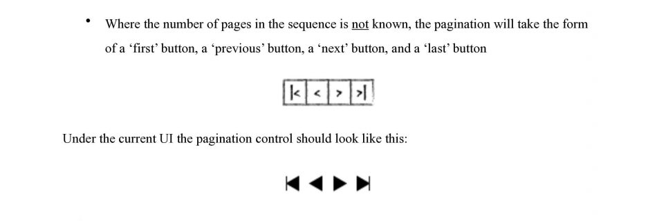
HSBCnet required a document describing the form and usage of common elements – essentially a design system with detailed usage guidelines. One of the elements I looked at was the pagination model they were using for multi-paged tables. Gathering Samples I started by sketching out as many different pagination forms as I could find. After …
Read more “HSBCnet Uses & Principles Document: Pagination”
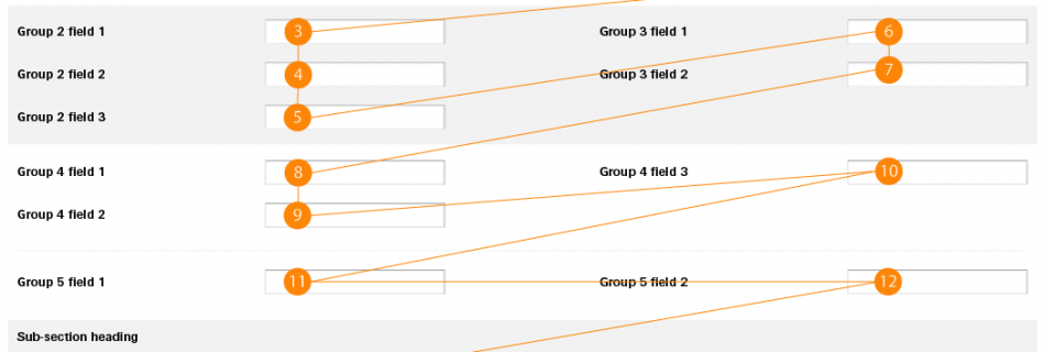
The client was adamant that, in cases where forms were spread over two columns, they should follow their traditional standard of left-to-right input sequencing regardless of the content of the form. This made for some confusing forms, especially when entering addresses or full names (including middle names). Finding The Best Route I needed to provide …
Read more “HSBCnet Uses & Principles Document: Forms (via Friday)”
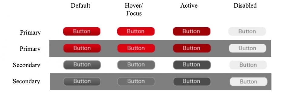
As a part of the HSBCnet ‘Uses and Principles’ document, I looked at how buttons were used throughout the system. Accepted Patterns Using Google I searched for images of system dialogue boxes and interfaces that included buttons – as the end-users for the buttons were almost entirely Windows users I decided to focus my attention …
Read more “HSBCnet Uses & Principles Document: Buttons (via Friday)”