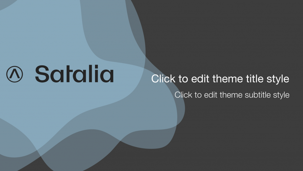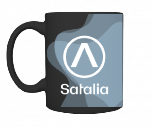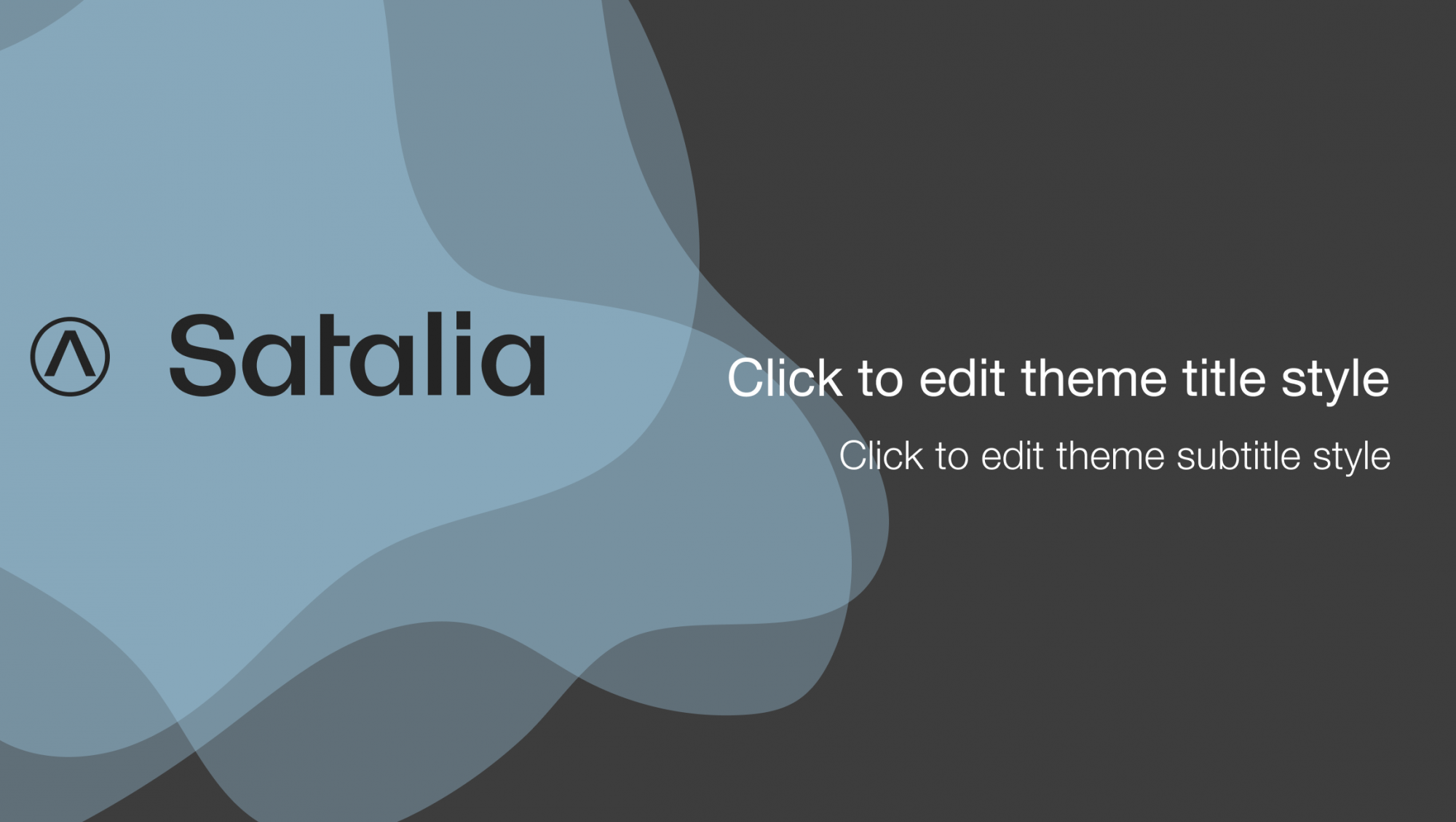
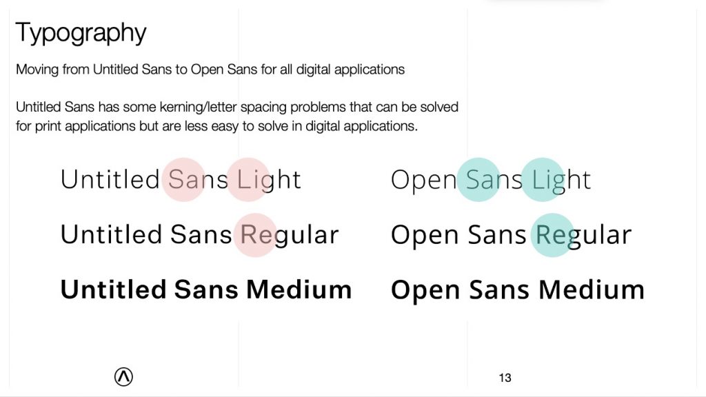
As I joined Satalia it became clear that the brand design they had was unfit for much more than the most basic print advertising and the font was expensive to licence and required lots of adjustment to make it work.
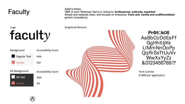
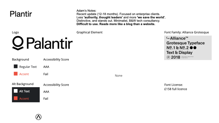
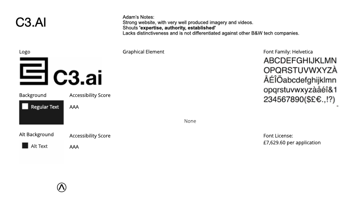
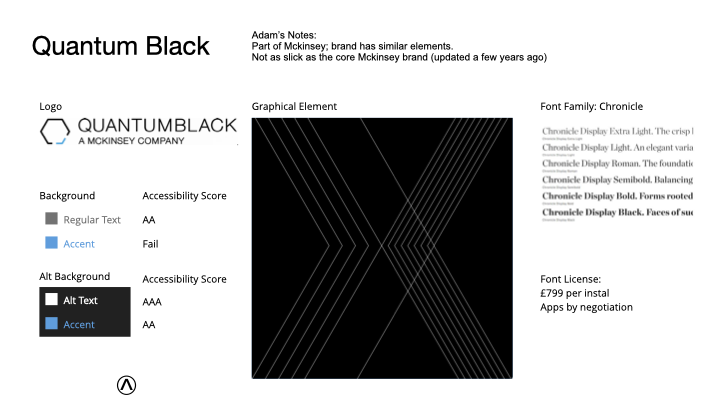
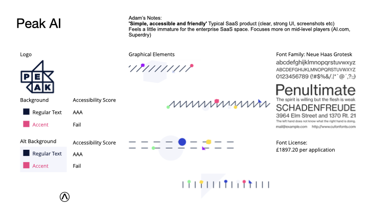
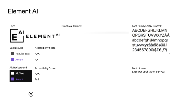
I carried out some case studies of other Artificial Intelligence companies and it was clear that the Satalia brand was significantly lacking in colours and graphical elements.
Motivation
After chatting with the company’s founder I found that he was passionate about environmental issues and creating a non-hierarchical workforce that could swarm in and out of teams as needed.
Dark mode by default
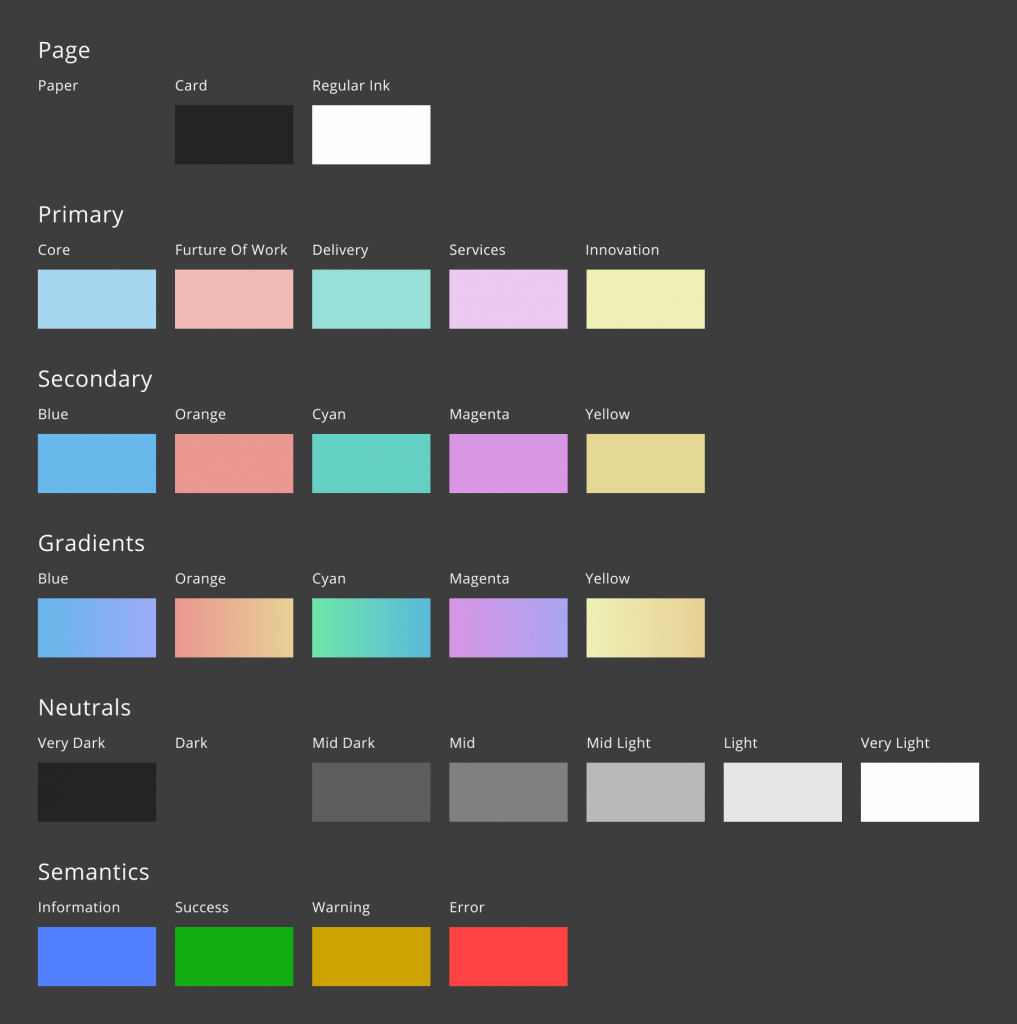
The existing brand only had two colours: black and white. This made everything harsh and difficult to read on a screen. I chose a ‘Dark mode by default’ approach. The idea was that we could save energy over brighter screens.
I chose fully accessible colours to represent the different facets of the company along with secondary colours and gradients as well as a set of semantic colours.
Finally, I swapped the font for one that was very similar but higher quality and free to use.
Swarms
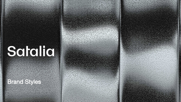
Graphical elements were limited to an abstract form that looked like corrugated metal. No one in the company understood the significance of this imagery and it caused accessibility and layout issues wherever it was used.
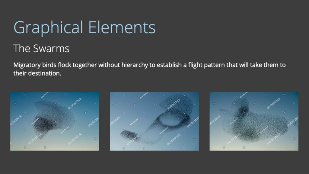
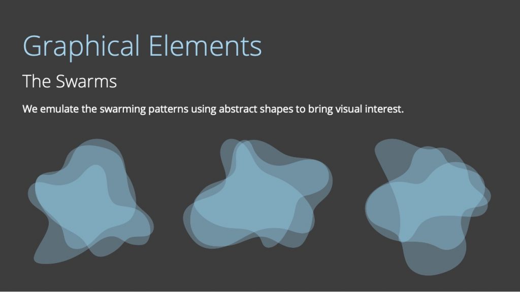
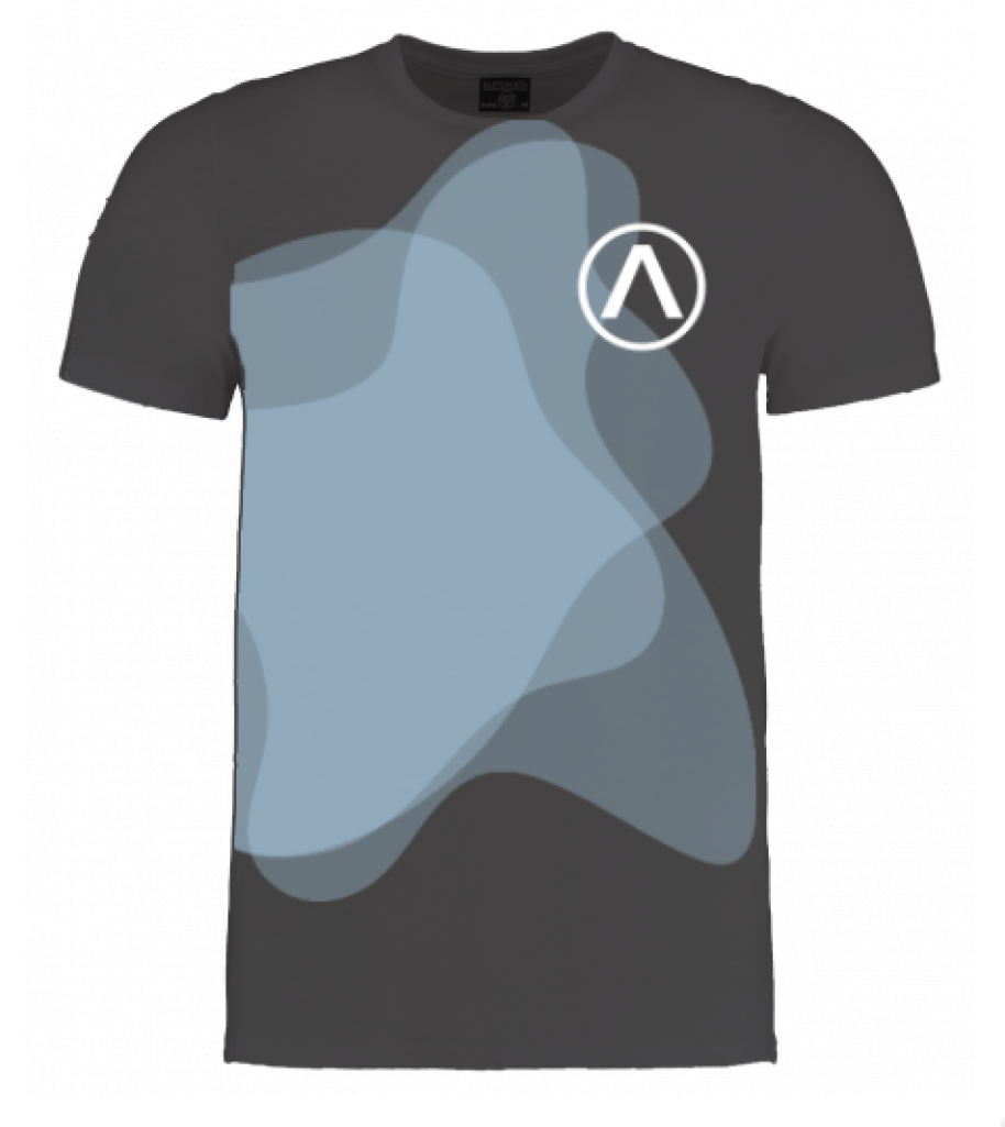
Using the idea of workers coming together in ‘swarms’ for projects, I decided to mimic some of the patterns made by migratory birds and chose those as the new graphical elements.