As I joined Satalia it became clear that the brand design they had was unfit for much more than the most basic print advertising and the font was expensive to licence and required lots of adjustment to make it work. I carried out some case studies of other Artificial Intelligence companies and it was clear …
Read more “Satalia – Brand Refresh”
After acquiring a book of blueprints from the props department of the Star Wars films, I thought it would be interesting to produce a Star Wars font that wasn’t part of the usual on-screen experience. I scanned the various letter shapes and punctuation that I could find, and brought them into Adobe Illustrator to convert …
Read more “Blueprint ’77 Font Design”
Electronic music artist 7Hz Research needed a Logo and some cover art for various projects and releases. Understanding their name and what it meant to them led to an exploration of different ways to represent their image. The ‘Research’ part was left off because it made the logo more difficult to use. I looked at …
Read more “7Hz Research – Branding”
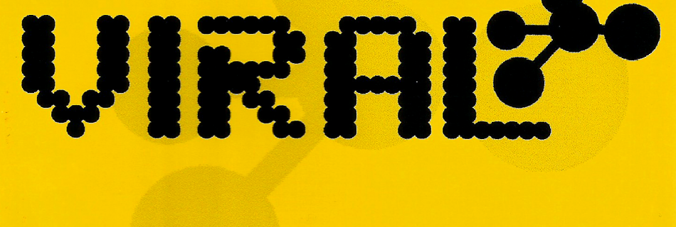
Trance music act “Viral” asked me to create branding and a CD slip cover for their first self-funded release. I chose the obvious ‘viral’ connection and chose a font that had an organic but microscopic feel. I added a simplified ‘molecule’ graphic that could be used as shorthand for the wordmark. Although the act never …
Read more “Viral Branding and CD Slip Cover”
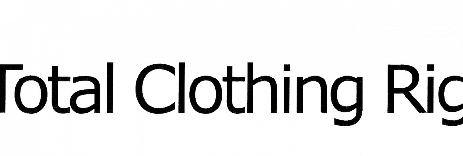
A small online community of people who believed that clothing should be ungendered asked me to produce a graphic for their website that would act as the branding for the group. As several group members were computer programmers, I opted to use the asterisk character, which represents an unspecified value. I added the copyright symbol …
Read more “Total Clothing Rights Logo”
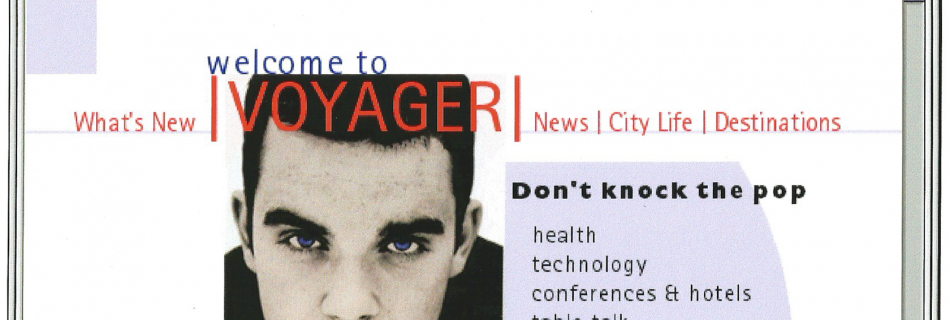
BMA approached Studio One asking for a website to accompany their inflight magazine. Much of the information architecture work was dictated by the structure of the magazine, so I took their top-level items and used them to form the main navigation, while the most commonly used items were listed directly on the home page. I …
Read more “BMA Voyager In-Flight Magazine Website (via Studio One)”
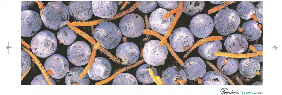
During some contract work at Saatchi, I was asked to generate some posters and billboards to accompany their Gordon’s Gin ‘The Work Of Art’ campaign for Diageo. The images came from Diageo’s library of Gordon’s promotional photos. I chose the best crop area to make them look like works of art.
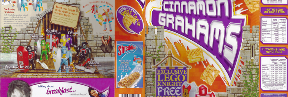
Nestlé had asked WK360 to build some pack art for a promotion with Lego Knights. The content and assets were provided, so this just became a simple layout exercise, prioritising the cereal branding while keeping the promotional content as visible as possible.
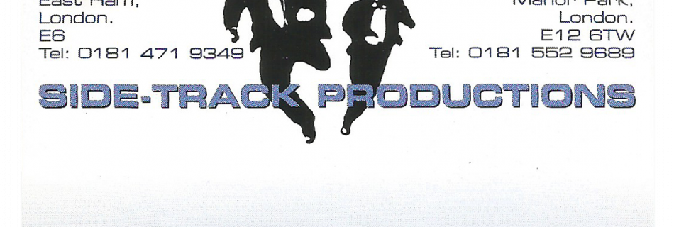
After college, I set up a small film company with my friend. He had already drawn the graphic of the two men running, so it was up to me to put them into some sort of setting and add some typography for a business card. I had been offered a tiny corner of someone else’s …
Read more “Sidetrack Productions Business Card”